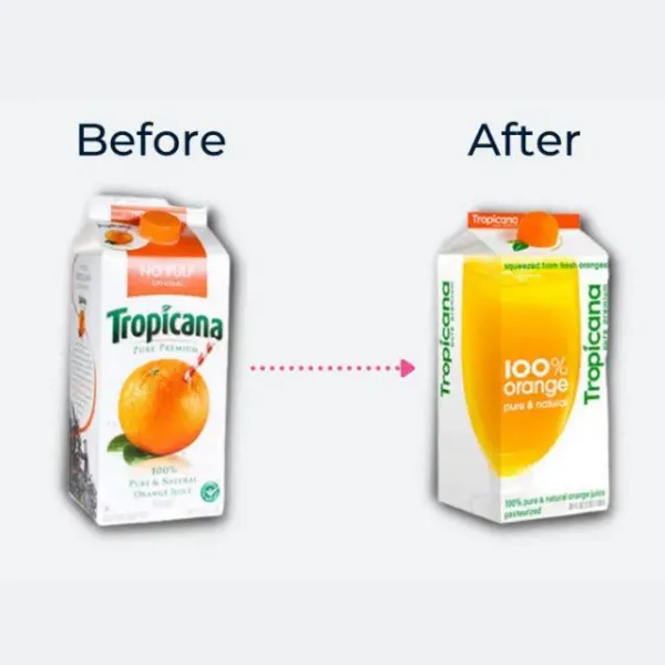
This rebrand resulted in Tropicana losing up to 20% in sales
Companies face pressure from the public if their brand image or packaging is “old” or “outdated”, which results in them sometimes spending millions of dollars to get a shiny contemporary polish for their logo and branding. Sometimes the change is met with positivity, but other times, there’s dramatic negative feedback and results that make companies regret ever thinking about it! Especially nowadays, as a lot of modern redesigns seem to be soulless. Let’s waste your time looking at some of these failed rebrands!
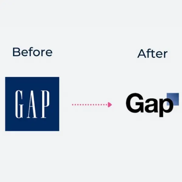
6 days after the GAP rebrand, they reverted to their old logo due to public outrage.
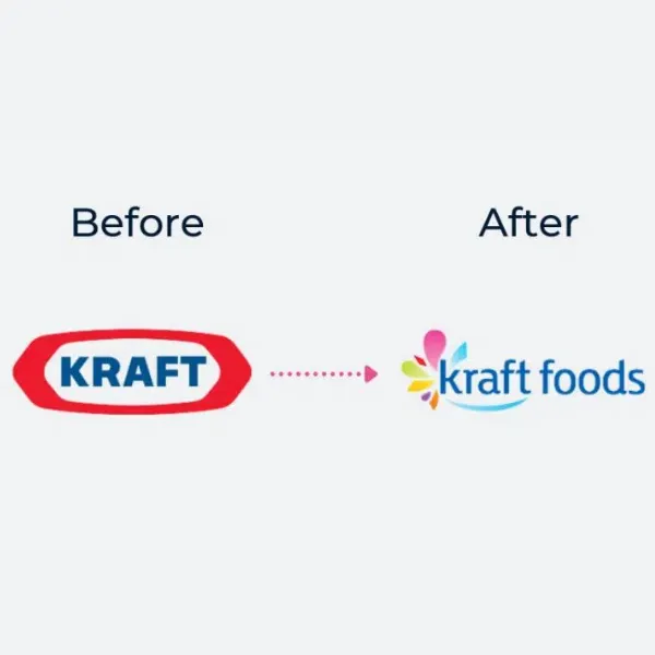
After 6 months, Kraft went back to their old logo, since the new one was unidentifiable in comparison.
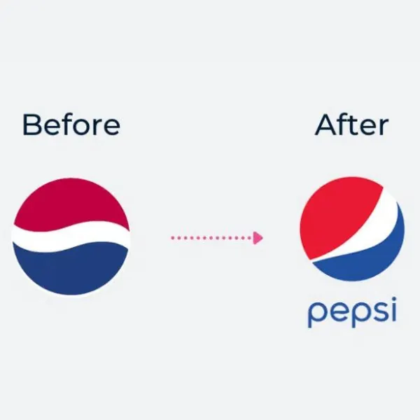
Pepsi spent $1 Million on this rebrand, which was met with strong negative feedback. However, they still use it today!
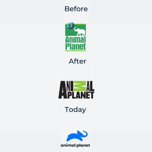
After a rebrand in 2008 that didn’t match the previous logo at all, Animal Planet rebranded in 2018 bringing back the elephant. What were they thinking in 2008??
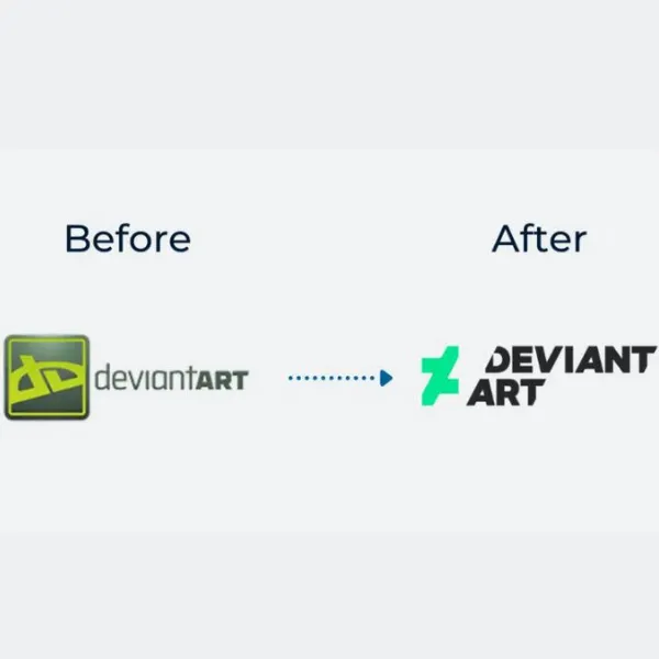
A website devoted to art and design, DeviantART changed their logo in 2014, keeping none of the same elements (except the spelling) that made their previous identity. Pretty bad for an art website.
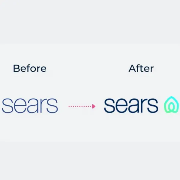
Sears changed its logo in 2019 — they kept the text relatively the same, but added a random symbol beside it. Only, this symbol ended up looking like Airbnb’s logo…
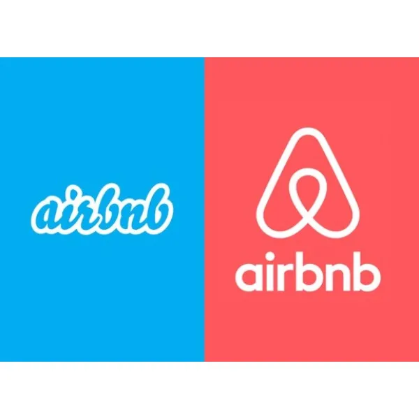
…which was made in 2014. When this logo came out, numerous remarks were made about how it looked like something…”anatomical”…
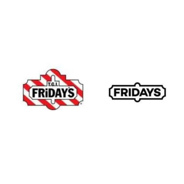
TGI Fridays originally did a rebrand in 2013 (not pictured) that at least had “TGI” in the title. But this 2020 change completely ditched the “TGI” and tried to bring back the old sign style. But making the rebrand “Fridays” was not well met!
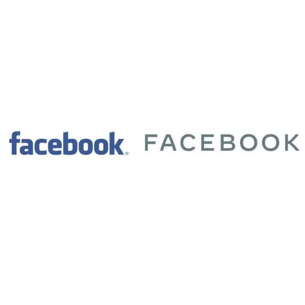
Facebook, a site with a billion users and access to all of their data and preferences, made one of the laziest and bland redesigns in 2019. It may be their “corporate logo”, but it lacks so much soul it actively has negative soul.